


![[BRAND] [SHOWCASE] xolve branding x Kiba Saigon - a tapas bar and restaurant in Saigon](https://media-api.advertisingvietnam.com/oapi/v1/media?uuid=0cdfc802-2776-4314-a5b2-ca7c148b572d&resolution=1440x756&type=image)


Combining Asian flavours with touch of Spanish cuisine, Kĩba is a tapas bar and restaurant situated right in the centre of Saigon. xolve team was approached to create the key visual identity and operation applications for the new restaurant. The name ‘Kĩba’ in Vietnamese word is the combination of ‘Kĩ’, which means being careful and attentive (service). ‘Ba’ is number three, which is the number of the person co-founded the place. Two of the co-founders, Donato and Pedro, are both originated from Spain.
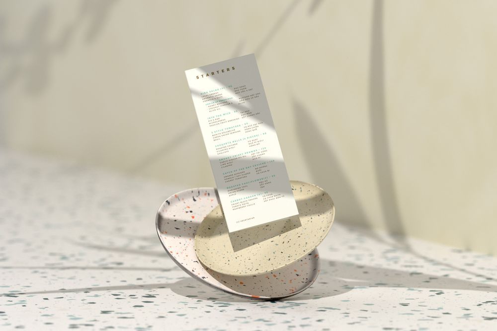
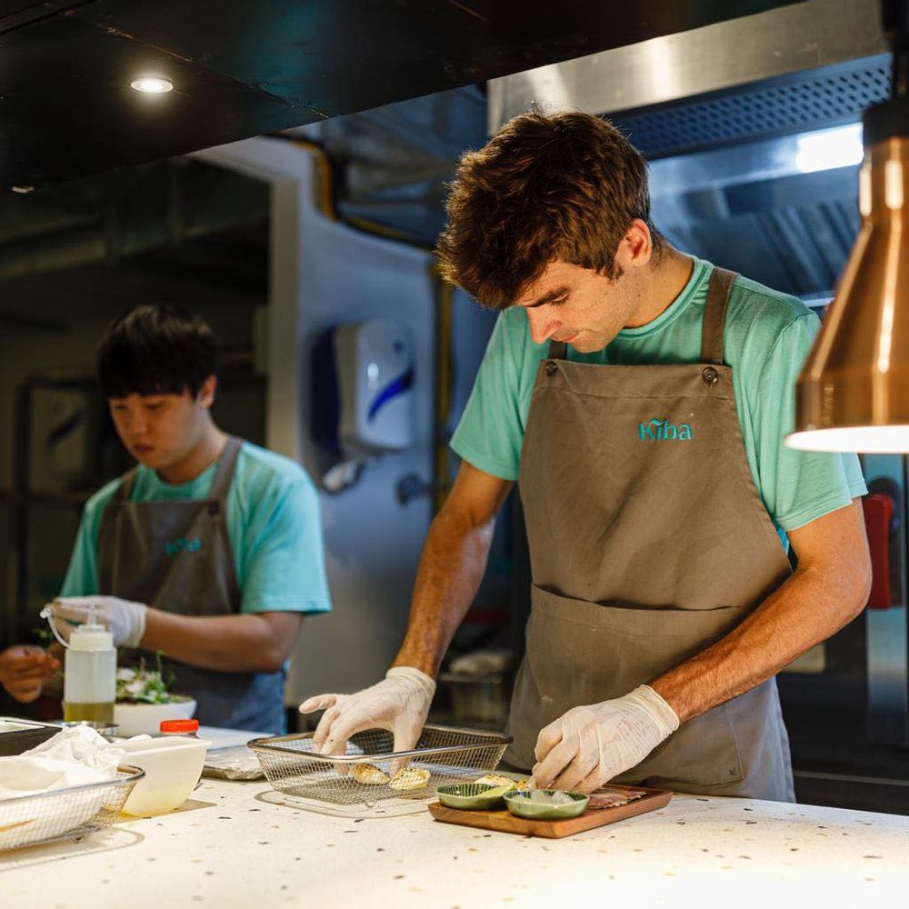
The restaurant atmosphere is hip and welcoming, including great classic cocktails and a wide selection of wine. The interior design is contemporary with terrazzo countertop and table, mint and earthly palette, open kitchen and bar, and lot of natural light and open space. Part of the herds and veggies from the menu are from the garden, which Kĩba dedicates its own precious space to grow.
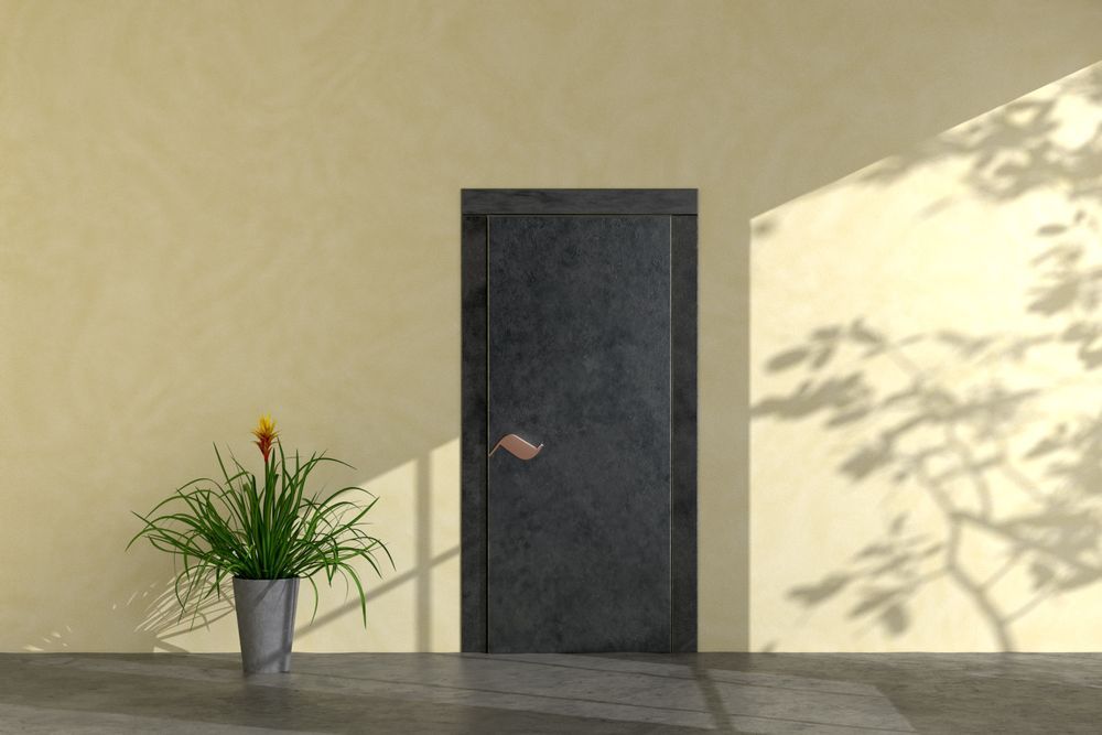
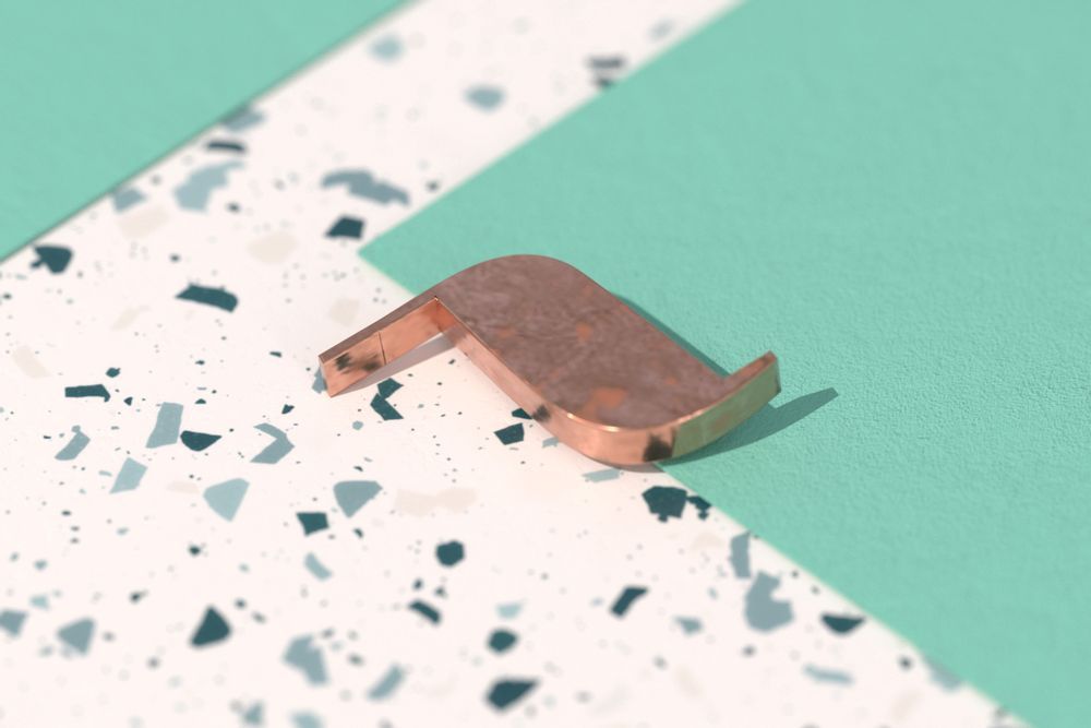
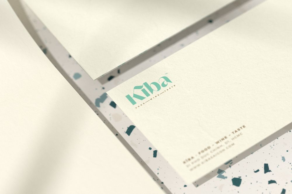
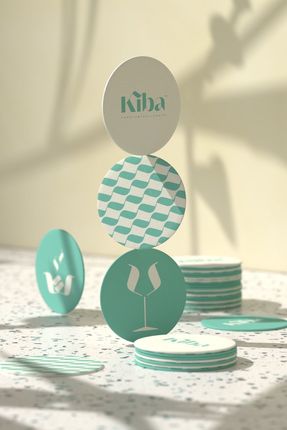
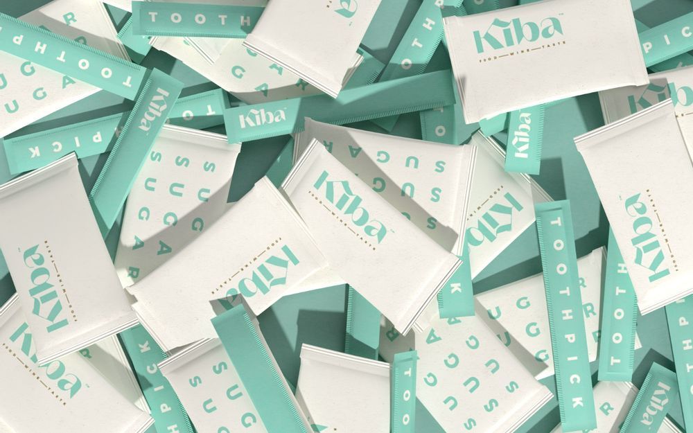
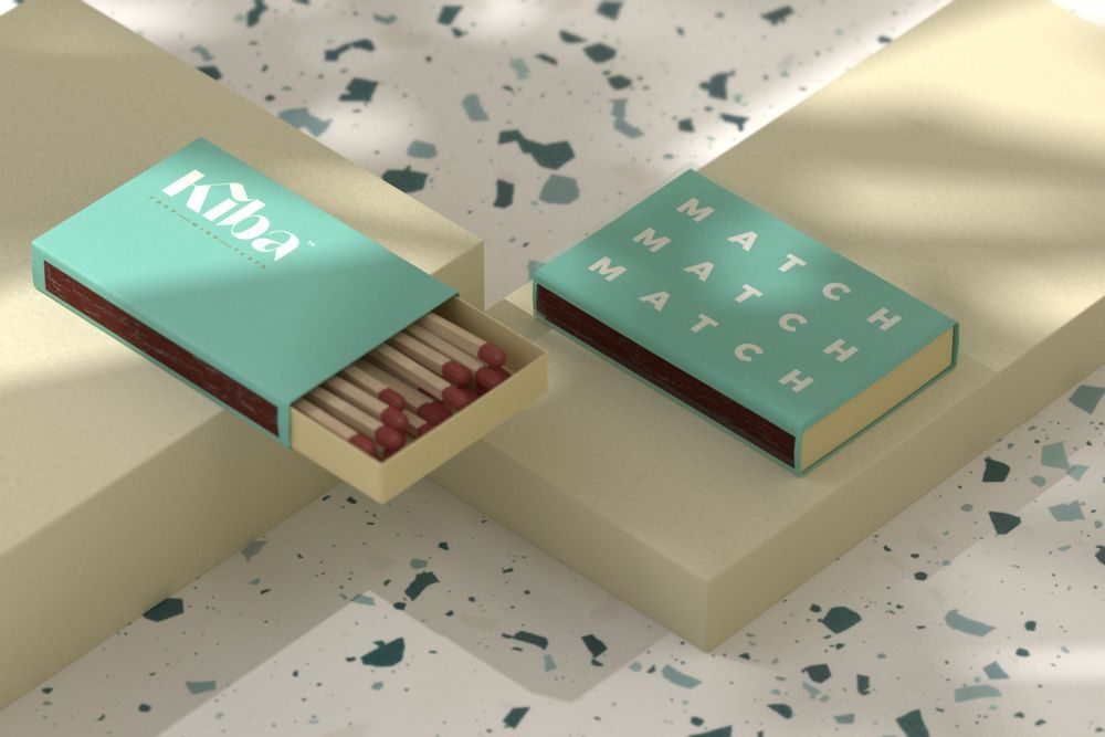
The design team strikes to emphasize the meaning and the message behind the brand name: triple the attentiveness, triple the carefulness, triple everything. The tilde sign is used as a pattern, and an element to create the icons. Physical use of the tilde sign also includes a door knob. Typography and layout design follows suit with overall modern look and feel. Minimum photos are used, instead, the team focus on typography. In addition to this, the element of three consistently extend to the menu with each dish contain mostly three main ingredients.
###
xolve is a branding studio based in Ho Chi Minh City, Vietnam. We bring business ideas to life with a defining purpose and aesthetic visual. Visit us at:
Website | Facebook | Instagram